


1
2
3
4
5
6
7
8
9
10
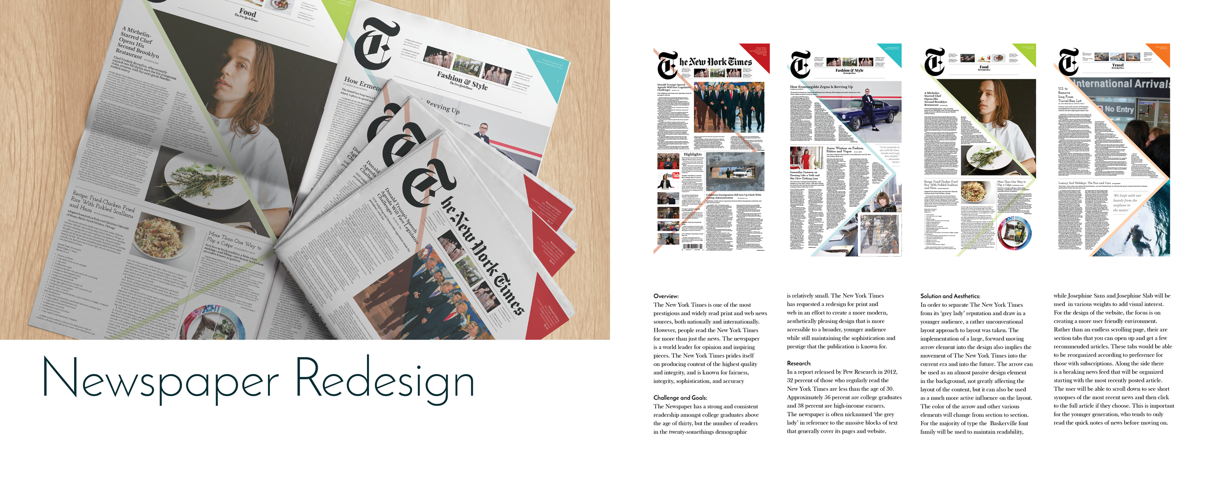
Overview:
The New York Times is one of the most prestigious and widely read print and web news sources, both nationally and internationally. However, people read the New York Times for more than just the news. The newspaper is a world leader for opinion and inspiring pieces. The New York Times prides itself on producing content of the highest quality and integrity, and is known for fairness, integrity, sophistication, and accuracy
Challenge and Goals:
The Newspaper has a strong and consistent readership among college graduates above the age of thirty, but the number of readers in the twenty-somethings demographic is relatively small. The New York Times has requested a redesign for print and web in an effort to create a more modern, aesthetically pleasing design that is more accessible to a broader, younger audience while still maintaining the sophistication and prestige that the publication is known for.
Research:
In a report released by Pew Research in 2012, 32 percent of those who regularly read the New York Times are less than the age of 30. Approximately 56 percent are college graduates and 38 percent are high-income earners.The newspaper is often nicknamed ‘the grey lady’ in reference to the massive blocks of text that generally cover its pages and website.
Solution and Aesthetics:
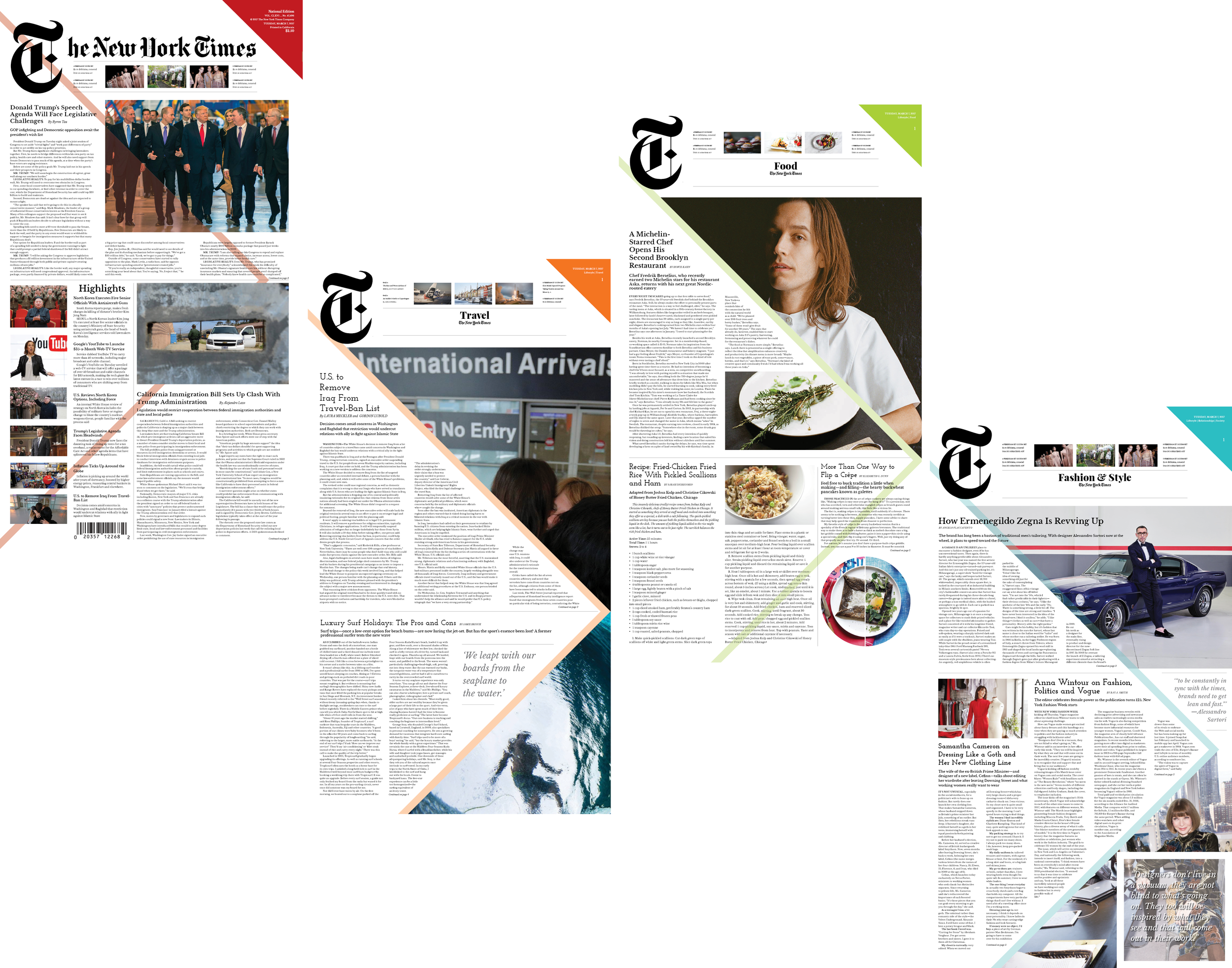
In order to separate The New York Times from its ‘grey lady’ reputation and draw in a younger audience, a rather unconventional layout approach to layout was taken. The implementation of a large, forward moving arrow element into the design also implies the movement of The New York Times into the current era and into the future. The arrow can be used as an almost passive design element in the background, not greatly affecting the layout of the content, but it can also be used as a much more active influence on the layout. The color of the arrow and other various elements will change from section to section.
For the majority of type the Baskerville font family will be used to maintain readability, while Josephine Sans and Josephine Slab will be used in various weights to add visual interest.
For the design of the website, the focus is on creating a more user friendly environment. Rather than an endless scrolling page, their are section tabs that you can open up and get a few recommended articles. These tabs would be able to be reorganized according to preference for those with subscriptions. Along the side there is a breaking news feed that will be organized starting with the most recently posted article. The user will be able to scroll down to see short synopses of the most recent news and then click to the full article if they choose. This is important for the younger generation, who tends to only read the quick notes of news before moving on.
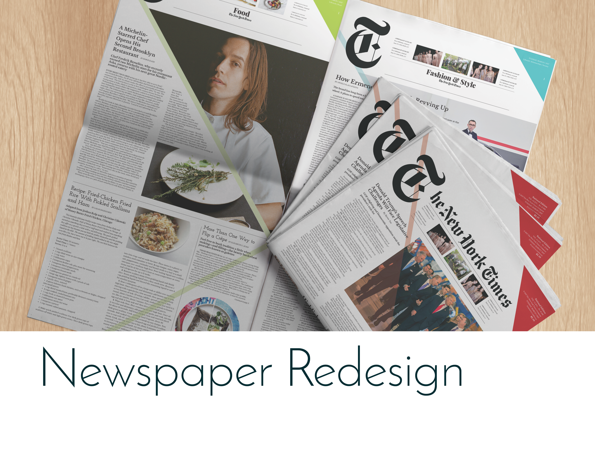
Newspaper Redesign
Overview:
The New York Times is one of the most prestigious and widely read print and web news sources, both nationally and internationally. However, people read the New York Times for more than just the news. The newspaper is a world leader for opinion and inspiring pieces. The New York Times prides itself on producing content of the highest quality and integrity, and is known for fairness, integrity, sophistication, and accuracy
Challenge and Goals:
The Newspaper has a strong and consistent readership among college graduates above the age of thirty, but the number of readers in the twenty-somethings demographic is relatively small. The New York Times has requested a redesign for print and web in an effort to create a more modern, aesthetically pleasing design that is more accessible to a broader, younger audience while still maintaining the sophistication and prestige that the publication is known for.
Research:
In a report released by Pew Research in 2012, 32 percent of those who regularly read the New York Times are less than the age of 30. Approximately 56 percent are college graduates and 38 percent are high-income earners.The newspaper is often nicknamed ‘the grey lady’ in reference to the massive blocks of text that generally cover its pages and website.
Solution and Aesthetics:
In order to separate The New York Times from its ‘grey lady’ reputation and draw in a younger audience, a rather unconventional layout approach to layout was taken. The implementation of a large, forward moving arrow element into the design also implies the movement of The New York Times into the current era and into the future. The arrow can be used as an almost passive design element in the background, not greatly affecting the layout of the content, but it can also be used as a much more active influence on the layout. The color of the arrow and other various elements will change from section to section.
For the majority of type the Baskerville font family will be used to maintain readability, while Josephine Sans and Josephine Slab will be used in various weights to add visual interest.
For the design of the website, the focus is on creating a more user friendly environment. Rather than an endless scrolling page, their are section tabs that you can open up and get a few recommended articles. These tabs would be able to be reorganized according to preference for those with subscriptions. Along the side there is a breaking news feed that will be organized starting with the most recently posted article. The user will be able to scroll down to see short synopses of the most recent news and then click to the full article if they choose. This is important for the younger generation, who tends to only read the quick notes of news before moving on.
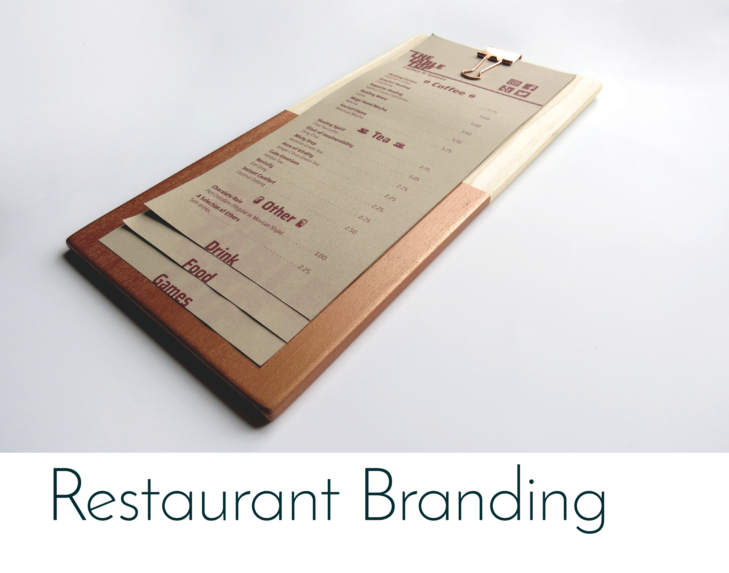
Overview
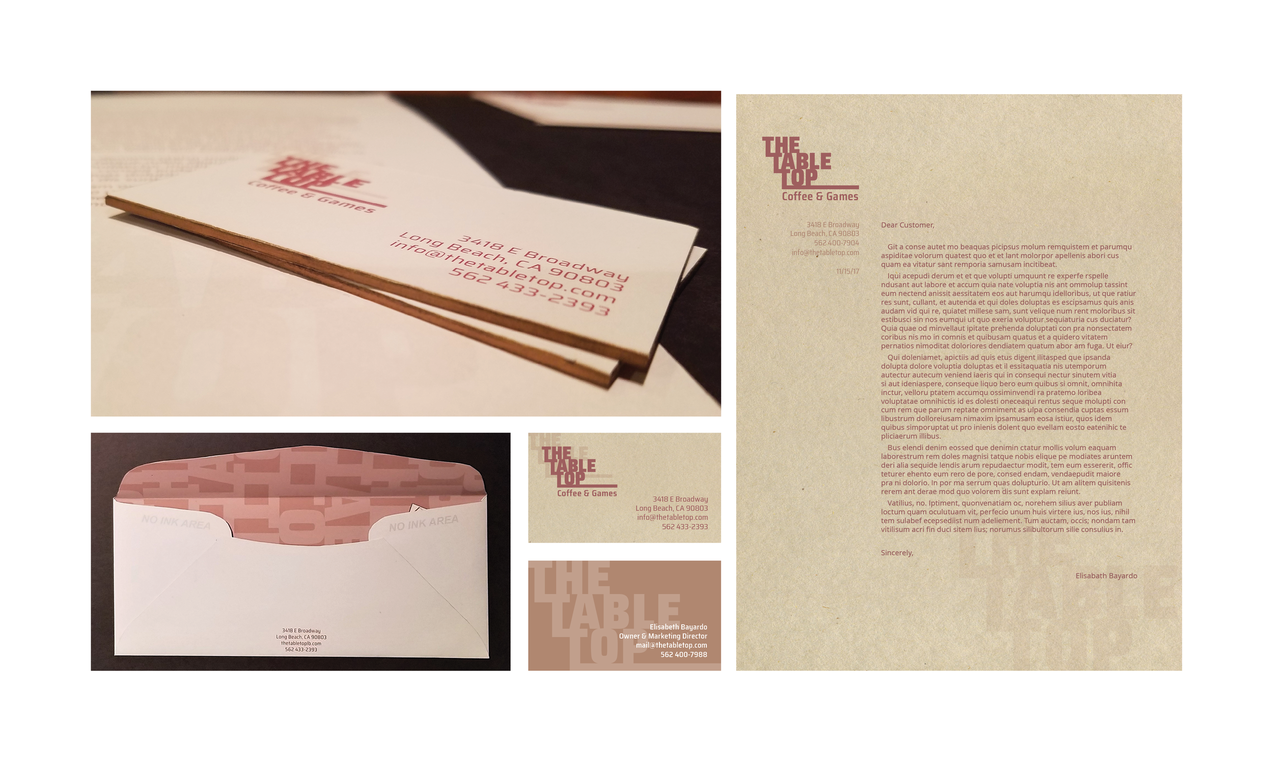
The Table Top: Coffee and Games is a cafe and game shop located in Long Beach, California. The owners hope for it to be a place where both gamers and non gamers feel welcome to hang out and spend time. People who already play board games can use it as a place to gather and play, and those who are less familiar can come and drink coffee, read, study, and possibly try a game they never have before.
Callenge and Goals
Create a logo to be used in various branding applications as well as letterhead, envelope, business cards, and menu for the restaurant.
Research
There are other game shops, but many of them have a very exclusive, closed off atmosphere. If you aren’t a gamer, or if you are a gamer that they don’t know, you will not be welcomed.
Solution
The logo was the first thing to be designed. The T’s are all linked together and they extend at the bottom to invoke the idea of a table top. This is used to direct the eye through the layout of the business card and letter head. It is also utilized in the menu to create a masthead that forms around the binder clip. The logo is also used throughout the designs in a very light opacity as a sort of watermark.
A sans serif font of the same family as that of the logo is used throughout to maintain a sense of continuity in the typography as well as add to the contemporary feel. In keeping with the sense of warmth the owners hope to give off, warm tan paper is used along with a brick red ink and accents of metallic copper. The copper helps to give the branding a more contemporary edge as well as an accent in color and texture.
Restaurant Branding
Overview
The Table Top: Coffee and Games is a cafe and game shop located in Long Beach, California. The owners hope for it to be a place where both gamers and non gamers feel welcome to hang out and spend time. People who already play board games can use it as a place to gather and play, and those who are less familiar can come and drink coffee, read, study, and possibly try a game they never have before.
Callenge and Goals
Create a logo to be used in various branding applications as well as letterhead, envelope, business cards, and menu for the restaurant.
Research
There are other game shops, but many of them have a very exclusive, closed off atmosphere. If you aren’t a gamer, or if you are a gamer that they don’t know, you will not be welcomed.
Solution
The logo was the first thing to be designed. The T’s are all linked together and they extend at the bottom to invoke the idea of a table top. This is used to direct the eye through the layout of the business card and letter head. It is also utilized in the menu to create a masthead that forms around the binder clip. The logo is also used throughout the designs in a very light opacity as a sort of watermark.
A sans serif font of the same family as that of the logo is used throughout to maintain a sense of continuity in the typography as well as add to the contemporary feel. In keeping with the sense of warmth the owners hope to give off, warm tan paper is used along with a brick red ink and accents of metallic copper. The copper helps to give the branding a more contemporary edge as well as an accent in color and texture.
Overview
Starbucks Coffee is the most popular and wide reaching coffee brand in the world. Because of it’s popularity, many of the company’s busier store fronts are overwhelmed with people waiting in line and subsequently to receive their drinks. The location on the Chapman University campus is especially busy, with lines winding through the shop at multiple times through the day. The staff is stretched thin trying to take all of the customers orders and make their drinks.
Callenge and Goals
Create a tablet kiosk app to expedite the ordering process and allow the baristas to focus on making the drinks. Specifically for the location at Chapman University, the students must be able to check out either with their credit/debit card or the money loaded onto their student ID cards.
Research
Customers at the Chapman University location were interviewed to see what they felt might alleviate some of the congestion. The location was also scout to see where would be an ideal spot to place kiosks.
Solution
The Starbucks brand is very well established, and so lots of inspiration was taken from the existing website and mobile app. In order to keep the app feeling clean and cohesive, different tints of the same Starbucks green are used throughout over white. The main food and drink categories are represented by vectorized icons, while the individual flavors are shown in real photos of the drinks. On the checkout page there is an option to pay with credit or debit cards or with the students’ pre loaded money known as panther bucks.
UX/UI Design
Overview
Starbucks Coffee is the most popular and wide reaching coffee brand in the world. Because of it’s popularity, many of the company’s busier store fronts are overwhelmed with people waiting in line and subsequently to receive their drinks. The location on the Chapman University campus is especially busy, with lines winding through the shop at multiple times through the day. The staff is stretched thin trying to take all of the customers orders and make their drinks.
Callenge and Goals
Create a tablet kiosk app to expedite the ordering process and allow the baristas to focus on making the drinks. Specifically for the location at Chapman University, the students must be able to check out either with their credit/debit card or the money loaded onto their student ID cards.
Research
Customers at the Chapman University location were interviewed to see what they felt might alleviate some of the congestion. The location was also scout to see where would be an ideal spot to place kiosks.
Solution
The Starbucks brand is very well established, and so lots of inspiration was taken from the existing website and mobile app. In order to keep the app feeling clean and cohesive, different tints of the same Starbucks green are used throughout over white. The main food and drink categories are represented by vectorized icons, while the individual flavors are shown in real photos of the drinks. On the checkout page there is an option to pay with credit or debit cards or with the students’ pre loaded money known as panther bucks.
This is a poster design for the Mercedes-Benz Classic Center to showcase the 300 SL. It was designed in the art deco style to reflect the vintage sensibilities of both the Mercedes-Benz Classic Center and the 300 SL. The goal was to channel the aesthetic and appeal of vintage art deco style posters from the Grand Prix in Monaco circa the 1930’s SL. Along with utilizing the art deco style, the object of the project was to exemplify the beauty of the chosen model of car, in this case the 300SL, through digital illustration.
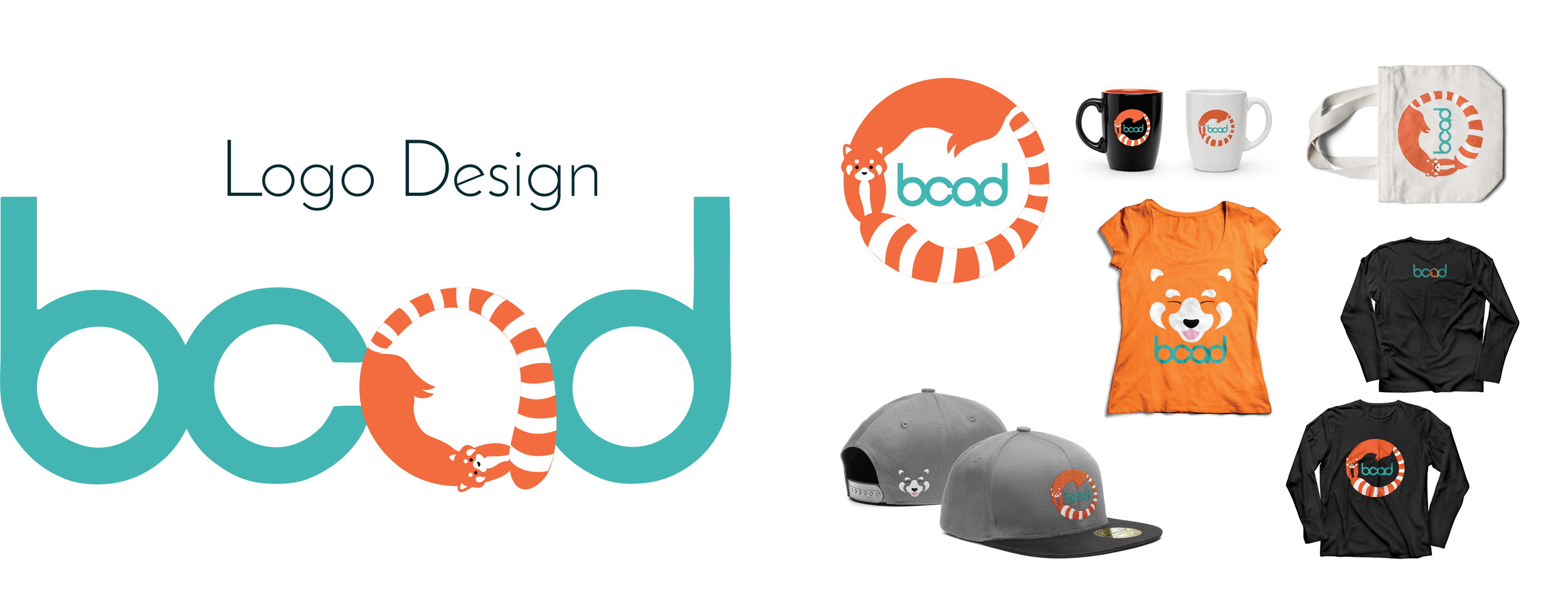
This logo design was done for a fictional university, Bayardo College of Art and Design. The red panda was chosen as the mascot, and the logo was designed to emphasize the fun, creative spirit and energy of the University. Focus of the design was placed on the beauty in the form and patterns of the animal. The circular logo was based on the full body of the red panda, while the face logo was designed to play with negative space and the markings of the red panda. The orange was chosen based off of the animal’s natural color, while the teal blue was chosen as a bright contrast to continue the feeling of energy and fun.
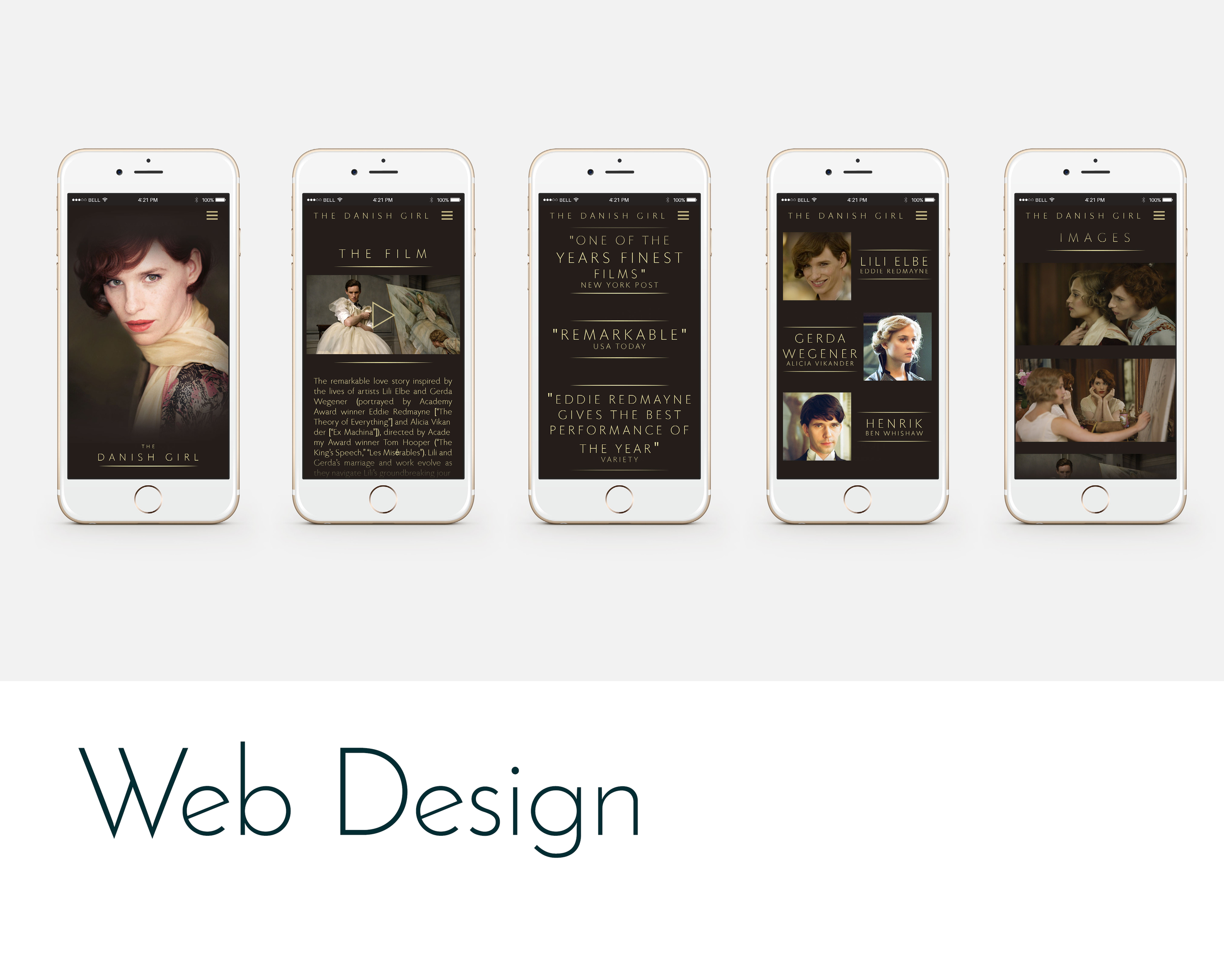
Overview
The Danish Girl was a 2015 film distributed in the U.S. by Focus Features. It was nominated for many academy awards, including Best Actor, Best Costume Design, Best Production Design, and Best Supporting Actress for which Alicia Vikander received the Oscar.
Challenge and Goals
Focus Features requested a website for The Danish Girl to be designed before the 2015 Academy Awards in order to promote the film. It needed to be easy to navigate as well as visually appealing and needed to fit with the mood of the film itself. There also needed to be sections for the trailer and film synopsis, some of the nominations and awards the film had received, a cast list with short bios, and an image gallery. A contact form and social media icons and links were also required.
Research
Design research for the site began with viewing of the film. It has an overall moody aesthetic with lots of warm, sepia tones and touches of golden light.
Solution
In keeping with the mysterious, warm tones of the film, deep browns and sepia were used throughout the design of the website. The golden accents of the production design were met with golden accents in the text and symbols of the website.
The same font that had already been used for The Danish Girl title and other branding was kept in use for the website to maintain a cohesive feeling between the various forms of media. A clean layout within the sections and a landing image help the user navigate the site with ease.
Overview
Serenity Soaps is a new company based in Portland, Oregon. Their focus is on providing consumers with natural, hypoallergenic, homeopathic alternatives to other products on the market while still maintaining a sense of luxury and leisure. Each one of their variety of scents is categorized based on a pair of characteristics such as hydrating and nourishing, refreshing and invigorating, and calming and soothing.
Challenge and Goals
The packaging for Serenity Soaps must represent the overall focus of the company as well as each individual scent.
Research
Since Serenity Soaps is a natural brand, the target audience would be people who shop at stores like Whole Foods. Packaging for other natural soap brands was referenced in order to determine what elements should be included, as well as to learn what worked and failed for other brands.
Solution
The overall concept was to focus on the idea of serenity, which is both the name and mission of the company. From this stemmed the image of a sleeping cat: calm, relaxed, content. The hand drawn logotype incorporated into the image of the cat matches with the companies natural methods and ingredients while giving the packaging a bit more whimsy. Once the logo and typeface were decided on, it was a matter of choosing a color pallet for each unique scent that would both represent itself individually while still feeling at home amongst the rest. Readability was very important as it was something found to be lacking in packaging for some of the competing brands, so ribbons of color were used to highlight the names of the scents. This ribbon also acted as the surface which the cat was resting on. The cat is always a light color in order to insure that the brand name reads clearly over it.